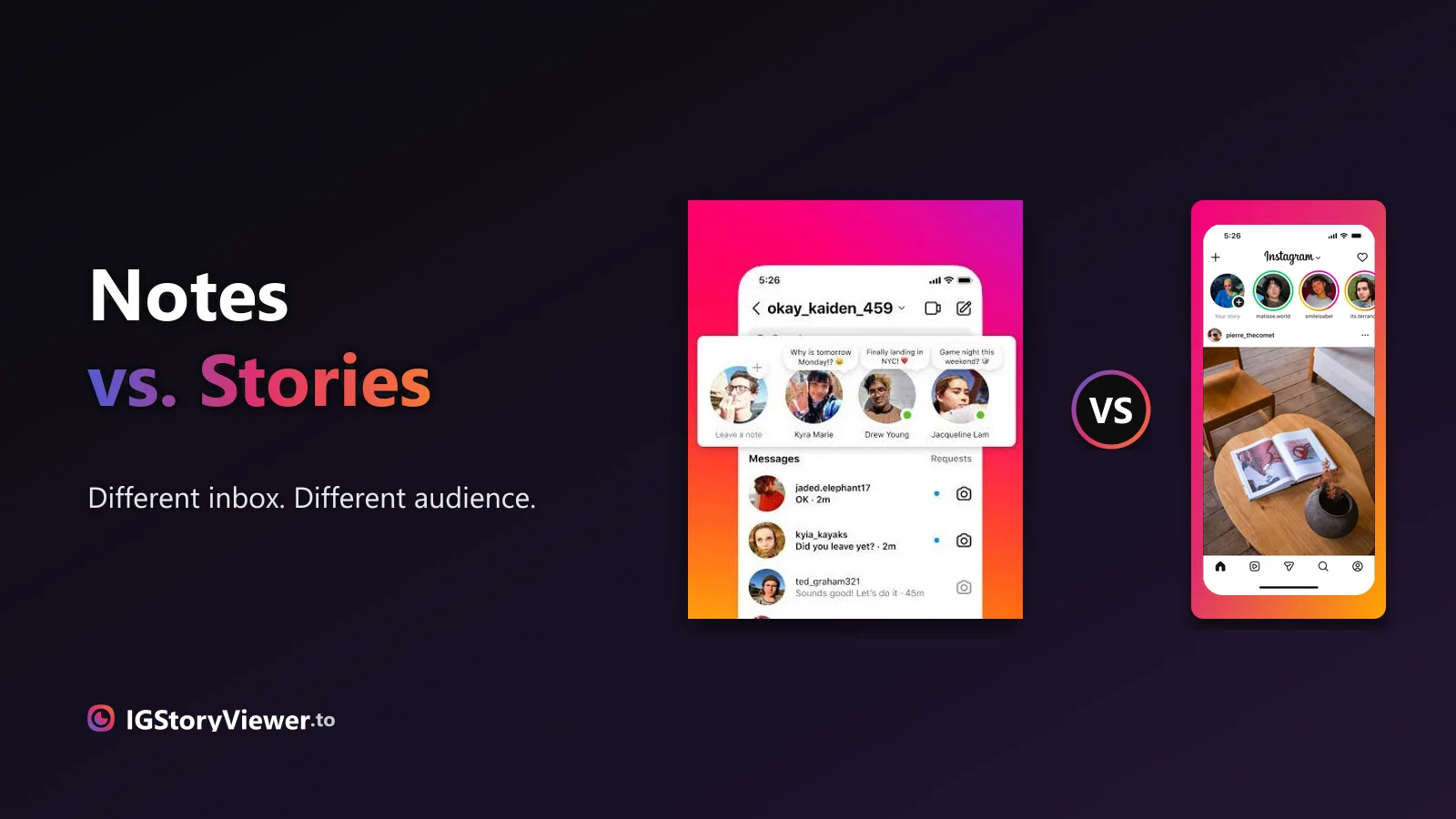
Instagram Notes vs. Stories: What's the Difference and Who Actually Sees It
A Note lives above your DM inbox and disappears in a day. A Story lives in the main feed. Here's what actually separates them.
 IG Story Viewer TeamSeptember 19, 20266 min read
The exact pixel canvas, the zones Instagram's own interface covers, and the cheat sheet that keeps your text and faces from getting cropped or hidden.
You spend ten minutes lining up a Story — the photo centered, the text exactly where you want it — and then Instagram's own interface covers half of it. The username bar sits on your headline. A reply field lands right on top of the button you wanted people to tap.
None of that is random. The canvas size, the zones Instagram's interface always covers, and the area that's actually guaranteed clear are all fixed numbers. Here's the full cheat sheet.
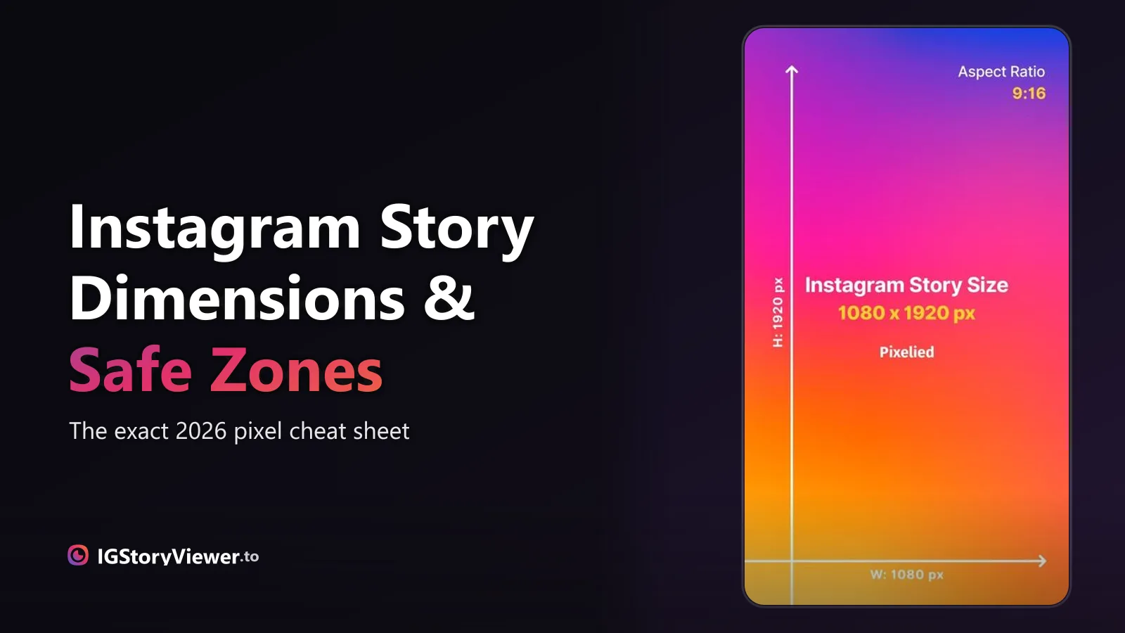
A Story is a vertical canvas — 1080×1920 pixels, a 9:16 aspect ratio. That's the shape Instagram renders every Story at, whether you're posting a straight photo, a video, or a Reel pushed to your Story.
Upload something that doesn't already match — a square feed post, a landscape screen recording — and Instagram doesn't ask first. It centers what it can and fills the rest with blur or plain color, which is why a repurposed post so often looks like an afterthought instead of something made for the format.
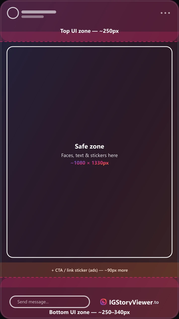
1080×1920 is what you upload. It's not what's actually visible once Instagram's own controls load on top of it — two bands get covered every time, on every device, no matter whose account is watching.
The top roughly 250 pixels carries the profile photo, username, timestamp, and the three-dot menu. The bottom is less consistent: about 250 pixels on a plain story (just the reply field and reaction bar), closer to 340 pixels once a link sticker or a call-to-action button sits on top of that.

Bookmark this — it's every number above, plus the two limits worth knowing before you export anything.
| Full canvas | 1080 × 1920 px (9:16) | What Instagram displays every Story at |
| Minimum resolution | 1080 × 1920 px | Upload smaller and Instagram upscales it — that's where the blur comes from |
| Top safe clearance | ~250 px | Profile photo, username, timestamp, and the menu sit here |
| Bottom clearance (organic) | ~250 px | Reply field and reaction bar |
| Bottom clearance (link sticker / ad) | ~340 px | Extra room for a CTA button or swipe-up link |
| Center safe zone | ~1080 × 1330 px | Keep faces, text, and stickers inside this box — accounts for a link sticker or CTA |
| Max video length per segment | 60 seconds | Longer clips get auto-split into back-to-back segments |
None of these are pixel-for-pixel guarantees — Instagram can nudge a UI element by a few pixels between app updates. Treat the safe zone as a buffer, not a hairline: staying comfortably inside ~1080×1330 survives minor interface tweaks that a design cut exactly to 250px doesn't.
Four habits make the difference between a Story that looks intentional and one that looks like a resize job.
Faces, logos, and text belong inside the middle ~1080×1330 box — the only part guaranteed visible.
That's exactly where the reply bar sits. A button or link there gets tapped by accident or missed completely.
Retrofitting a square or landscape asset almost always means an awkward crop or a blurry pad.
Most phones shoot at a different ratio than 9:16 — check the crop before you post, not after.
Interactive stickers — polls, questions, countdowns, the link sticker — aren't fixed in place. You drag them wherever you want on the canvas, which means the safe-zone math applies to them just as much as your background photo or your caption text.
The most common mistake isn't ignoring the safe zone on a background image — it's dragging a poll or a question box down toward the bottom of the screen because that's where your thumb naturally rests while you're editing. Instagram lets you drop it there. The reply bar still covers it for everyone else.
A square feed post is 1080×1080. A Reel you filmed vertically is already 9:16 and drops straight in — though a Reel downloaded from elsewhere often has its own caption or like-count baked into the video itself, which stacks a second, uneditable layer of text on top of whatever safe-zone planning you just did. A landscape video — a screen recording, an old camera export, most clips downloaded from elsewhere — is the one that causes real trouble, because there's no way to stretch 16:9 into 9:16 without cropping the sides or padding the top and bottom.
If you're regularly deciding which format something belongs in before you even get to sizing it, it's worth understanding how a Story, a post, and a Reel actually earn their place — dimensions only matter once you've picked the right format to begin with.
Once the safe zones stop being a guessing game, filling that space is the fun part. 37 Story ideas is a genuinely usable list for whenever you're staring at a blank canvas and nothing comes to mind.
And if you want to see these numbers in action instead of on paper, our story viewer renders any public account's current Story at its real size — a fast way to see the safe zones described here on an actual, live Story instead of a mockup, before you commit to a layout of your own.
Open any public account's current Story at its original size and watch the safe zones play out for real.
We build a free, anonymous Instagram story viewer and write practical guides on watching, saving, and understanding Instagram stories — without the hype.
More about usA Note lives above your DM inbox and disappears in a day. A Story lives in the main feed. Here's what actually separates them.

The row of circles under your bio is simpler to build than it looks — here's how to create one, design a cover that matches, and edit it without losing anything.